
Hi! I saw this park and i decided to just give you the best constructive criticism that I could give you.
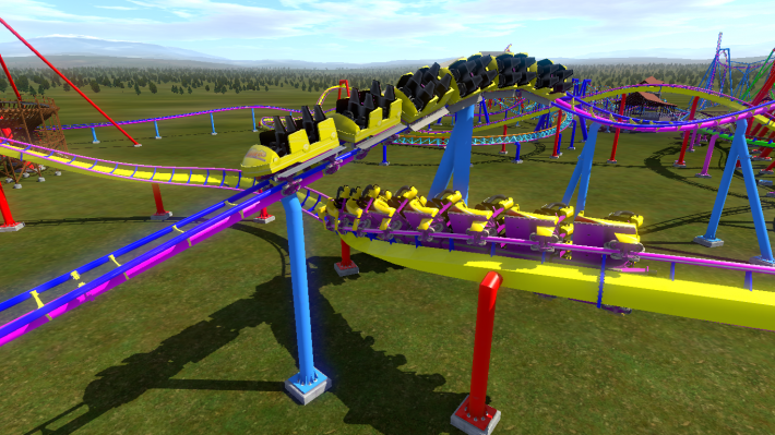
Next time you upload a park, put fewer coasters in one, please. The framerate sometimes goes down a bit because my PC has to render so many rollercoasters at once. The colors are painful to look at for a long time because they are so unrealistically strong. Turn down the saturation and brightness a bit, trust me. It'll still look cool. If you can, keep the Rails, Spine and Crossties as a single color. If you're feeling fancy, you can use two colors.
Some tips for you to help with things I noticed about the coasters themselves :
Launches have to be a basically perfectly straight section. There are two ways to make a track section not wobbly/curved. Double click on a vertex, and click on "Strict". The Vertex will automatically plop onto a straight line between two other vertices. If you make two consecutive Vertices strict, the section between them will be straight. Same with the stations.
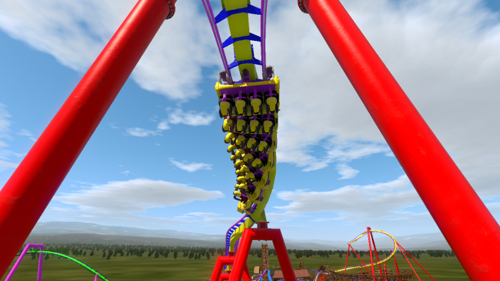
The Tilt coaster reminds me a lot of Tower of Terror @ Gold Reef City. Vekoma Tilts are usually a bit longer and have a full layout. They're not just a circle.
The same thing I said about launches and stations also applies to lifthills, just a little bit differently. Tire lifts can both go straight and curved. (Alpina Bahn and Olympia Looping are examples for curved lifts)
The shuttle coaster layout is not realistic, but definitely decent. I can definitely notice you were slowly getting the hang of the editor at that moment :D
I sadly don't have much more time to review any other coasters, but I took a look at your RMC.
To keep it quick: I really like it! It's a decent layout for being one of your first coasters.
I suck at reviews/explaining things so i hope this was helpful :D
-Yasu